SugarFreeSolution

A DIgital Sketchbook For A Digital Brief

12/06/2010

THE PITCH

Here is the pitch that i showed on Thursday and the feedback that was given (from what I can remember)!!!


PITCH FEEDBACK: THE IMPORTANT BIT!

- Strong and bold pitch and idea but be be aware of your audience, this might not fit in with all charities.

- Research was thorough, and was nice to see the 'experiment,' backing up what I'm saying

- How would the website work/ What software would be used to make it? (Didn't know what to say, something I need to work on, web software knowledge)

- Fresh, new layout!

- Not sure that the entrance page is actually required, search ultility on the main page.

- Unclear of where the sense of community lay.

- Consider the practicalities of how the my channel page would actually work.

- Key insight was good, the use of conversation and dialogue between audience and charity on the site.

- Loved the leave chocolate! sweet!

- Really liked how the brand and feel continued throughout every aspect of my presentation.

- Really enjoyed the idea of hiding information and making it easier to find and use.

that's all I can remember really, the pitch overall went well.

Communication Points I would consider for the next one:

- Really consider the tone of voice and audience - Who am I talking to?

I think that I may have been a little overly confident and slightly brash with my approach, which was down to nerves but next time I will really think about it.


09/06/2010

The Night Before The Pitch And Everyone Was Sleeping

All is quiet on the pitch night front....... NOT! just finished my presentation for the pitch and it could be better! I hope the content will do most the talking.

PDF - DONE
PDF on Disk - DONE
Leave Behinds - DONE
Prompt Cards - DONEish (caution may confuse :S)

Time for bed and weetabix in the morning - long day ahead.

Night. Diabetes UK you best like this!

Here are the leave behinds i will be giving the client tomorrow:
A booklet outlining the Navigation and user journey through the site.

And here is the business card wrap around. Around a DIABETIC chocolate bar of course!

07/06/2010

The Users' Journey

We're Going On A Journey!


It is important that I map out the users' journey through the site, from accessing it at Diabetes UK's existing site to showing the contributions after support has been made. I had mapped out the journey in both a timeline and visual forms so that i can start to understand how to make the animation for the final pitch. It is also important to put this visual journey in my leave behind explaining the process of the site.


I have story boarded the process to easily illustrate what WOULD happen on the site.
I have also considered User's emotions as they move through the site, and at what point is key to ask to support.

The Final Layouts

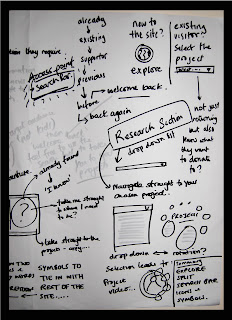
After finally deciding on one final page layout I have now changed the rest of the site so that the whole thing is consistent. I have changed the style of some of the drop down bars so that have a much more simple and contemporary feel. The site has taken me a long time just messing with layouts so that it looks effective and so if it where to be a real site, all the information is hidden but can also be found quickly and easily, giving a much more effective layout and functionality.

So here are the FINAL page layouts. Enjoy:


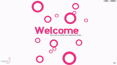
1. The Loading Screen

Nothing much has changed here, I did decide to remove the safari navigation bars so I felt it was complicated my site, and distracting when it came to the final presentation. As you have in previous posts the bubbles float up giving a sense of what the rest of the site is going to feel like. They give a calming and quite relaxing feel. the welcome page will have music overlaid, and as you can see I have kept the option to login and register at this point, so people can jump straight into the site. There is also always the option to return to the original site, identified through the diabetes logo.


2. The Entrance Portal

I decided to completely change the look of this page to give it more of a contemporary feel, like the rest of the site. Before I thought the page looked a little bit complicated, and there was just something that wasn't right about the copy, now I think the page is simple and clear with no reason for confusion. This page gives the user the opportunity to either explore the site (if they are a new visitor), search for a specific project (if they know what they are looking for) and also to login or register straight away. I have also changed the font so it is clearer and much less playful and much more legible to appeal to a wider target audience.


3. The Home Page (Central Page of The Site)

This is the main homepage which I previously showed, I haven't really changed anything here, I just used to to start to re - structure the rest of the site.


4. Navigation

I have changed the navigation slightly so that it ties in with the rest of the site. Adding a solid block with both curved and pointed corners. the navigation section at the top allows the user to understand the stages of using the site in simple drop down tabs, moving from one to another. i have also again changed the font to a more legible one.


5. Research Project Selection

The aim of this drop down is to allow the user to search for content on certain projects. It allows the user to select a project from a list of categorised projects or search for something more specific. I have completely changed the feel of this drop down. Looking back a previous designs, the layout was bland and looked quite unprofessional, it also used too much text and too many fonts making it look more complicated than it actually was. The new layout uses one font, and in theory gets rid of the drop down bar, which I feel made the site look dated.


6. Video and Content Selection

Once the viewer has selected a specific piece of content the content will be enlarged so they can see and play it fully. They than have the option to support, share, transcribe and archive, Selection of a symbol opens another drop down with more info. The use of strong clear symbols makes the site easy to use. The have changed the 2 drop down on this section, so that it looks more contemporary, I removed the grey box and changed the font as they did not look particularly professional.


7. Archiving Your Videos

This section allows you to archive a piece of content by dragging it into the bar, for later reference incase you want to come back to it later. I really tried to change the feel of this bar as I think the previous bar looked very 'autoshapy' (not a technical word aha) and the use of drop shadows did it no favours either so now I have used very simple shapes and symbols to get across the message. I have also added another scroll bar so you can simply scroll through your saved content.

8. My Channel

9. My Support


06/06/2010

Starting To Get To Grips With Flash

OK so I have started to use flash for the first time properly after Monica's initial workshop. I have tried to give the loading page and start page a sense of movement, trying to get to grips with the use of Flash and what it is capable of doing. The pacing is a little out on them but I think they are ok for a first attempt of animating in Flash. However if I can't make the homepage any better then it would probably be best to leave it out of the pitch as it may look messy.

Here is the loading page, I think that the circles give the viewer a nice sense of what the rest of the site is doing to appear like.


And this is the animation on the main page; it was extremely difficult to get to right (hence why this was a practice) I decided to try it just to give a sense of movement on the page, and show the importance of interactivity on the site.


I will attempt to tidy up the main page animation before making a decision as to whether or not to use it in the pitch.

05/06/2010

The Final Page Layout!!!

After all the comments and research that have gone into this project I am finally satisfied with my final page layout for the site. I have made a few changes to the design after my practice pitch and from one others have said. The first major change is the font used throughout the site, I decided to use a thinner sans serif font, that is clearer and much easier to read; also a font that I think will appeal to a wider target audience. I've removed the return to diabetes UK copy from under the logo; as I felt as though it cluttered up, what is meant to be a simple site. I have added a magnification symbol in the top right hand corner so that anyone who has poorer eye sight can enlarge any text on the site for better accessibility. Finally I added a new scroll bar, a much simpler and less distracting one, one which I feel has a much more contemporary feel to it, an aim I have had throughout the project.

So here is the final homepage (finally, after a lot of tweeking)


AND WERE THERE!

03/06/2010

My 'Practice Pitch' and Feedback

Firstly, here is the PDF I showed in my practice pitch:


Post Pitch Comments:

- The general feel of the Idea seemed to go down well with the group.
- Think about the 'User's journey for the pitch - will this be my main focal point?
- Key research and insights - how you got to the idea.
- Take another look at the fonts I have used and how appropriate they are for different uses and at different sizes.
- look at how you can make the site more accessible for people that have impaired sight (main audience ratehr than deaf)
- All the required content is there to go ahead and put pitch together.

02/06/2010

Bite The Bullet

I started thinking about the idea for the 'entrance to the site' and my idea of looking at colour blindness. After the tutorial and some serious thought form my part, I have decided that I'm not going to use the idea at all in this project. I feel that it was a nice idea, and played on the idea of audio and visual and playing on senses, but to give my idea more consistency and a better flow of an idea it will best to remove it from the campaign and focus solely on the navigation of the site. Although it is a little disappointing i think it will help my concept, and help diabetes UK really think about the functionality of their site and how to could be improved, rather than be fluffed up with a what is seemingly perhaps only a pointless game, that will have more negative than positive results.

Onwards and Upwards!

01/06/2010

Access Points

The first point that I am going to try and tackle is how to give my audience more than one access point to the information. By this I mean either giving more than one route to the information or by giving them a way of getting specific information quickly. I started to mind map some initial thoughts about the idea to try and see where that would take me:


I started with looking at what I had already; the fact that I like the idea, layout and functionality of the site as it is so I don't really want to change that radically, but how could I add another level to it? I thought about how the current layout is great to play around and explore if you don't have any specific research project in mind; but what about if you want some specific information.
form this I again noticed how I really enjoyed the feel of the word explore and what that could do for the site. Looking at different words that i could use in stead lead me to the idea of splitting the screen simple but effective thought. How could I juxta pose two words together in order to create two different entry points? Split the screen and have; an entry point for those who want to 'play' and one for those that want to skip that. A scroll down menu with all the research projects on, on one side of the screen would solve this problem.
But what about once your on the site; how can you filter down the projects quickly to something more specific? Simple; a search bar! I don't really know I over looked it but it would be ideal to sort through the masses of information; if you know what your looking for.
I also thought about how this spoilt screen idea would look and what it would actually say.
Icons is something that I really want to exploit now, after the tutorial earlier today, so i think I'm going to make a series of icons that have the Diabetes UK feel but also are clear as to their navigation. So basically the split screen will be represented by icons, when you scroll over copy will appear reading:

New to the site? Click here to explore.
Know what your looking for? select the project below.

Here's a really (I elaborate on quick aha) mock up of what I'm talking about.


Re Establishing Objectives

To give myself clearer objectives and to make sure that I'm on track with i want to do (and also stay on track) I decided to really home in on my Primary and Secondary objectives, and clearly outline them for reference:

PRIMARY:

To Re Present Diabetes UK's research projects in a contemporary and exploratory way, without compromising on current content or practicality.

Secondary

Provide a platform on which on online community can grow, sharing discussion and dialogue of current research projects.